By Frank Chezem
As the languages spoken throughout the United States change, cultural institutions should offer relevant, accessible, and meaningful multilingual interpretation to their audiences.
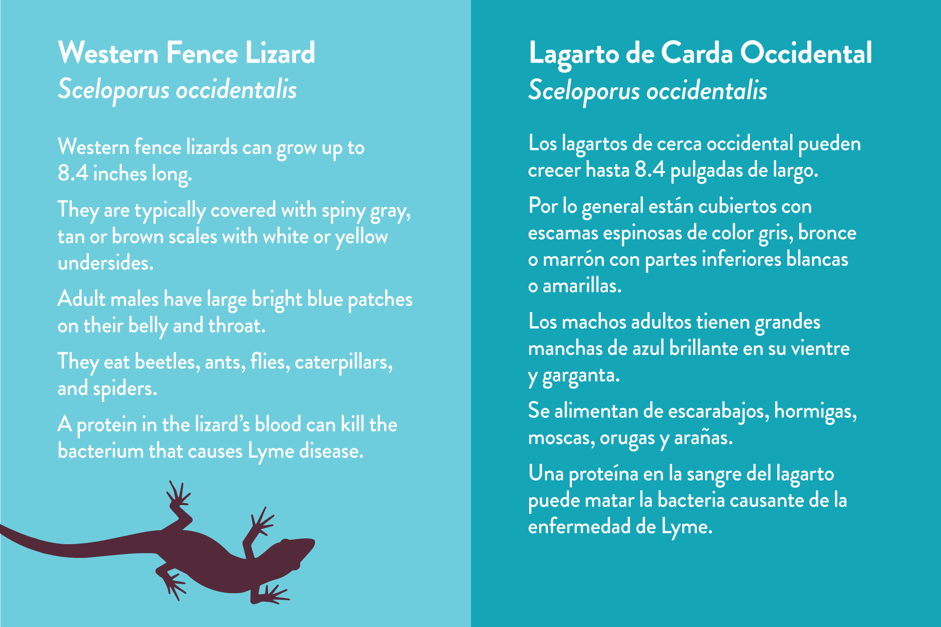
I worked with the Dunes Center (DC) in Guadalupe, California when they debuted four bilingual exhibits to help visitors discover the science, art, and beauty in the dunes ecosystem.
The DC is a basecamp for visitors who explore the neighboring 18 miles of California coastline and their mission is to promote conservation of the dunes through their interpretive exhibits, community outreach, and education programs.
Providing exhibits with bilingual interpretation that are accessible to visitors who primarily speak Spanish and/or English is important to the DC because 15% of Guadalupe residents speak Spanish at home. The DC’s Spanish-speaking members and visitors represent a significant audience of current and future decision makers who can help the DC advance their mission to conserve the dunes.
The U.S. Census Office forecasts that the United States will have the highest Spanish-speaking population—138 million—in the world by 2050.
Beyond Guadalupe, there are 41 million native Spanish speakers living in the U.S. and another 11.6 million who are bilingual, mostly the children of Spanish-speaking immigrants described in a 2015 study by the Spain-based nonprofit Instituto Cervantes. The study notes that the U.S. Census Office forecasts that the United States will have the highest Spanish-speaking population—138 million—in the world by 2050. Cultural institutions like the DC are rethinking how multilingual interpretation can reach diverse audiences to better serve their communities and their missions.
Design for your available space
The DC operates in a 1,200 square-foot building that houses the center’s exhibits in addition to staff offices, gallery space, and a library. Given the compact space, we knew from the start that multilingual exhibits would be a challenge. The limited space required two approaches: Printed graphics on exhibit panels, and digital interactive didactics presented with iPad kiosks. Both strategies produced benefits and a few challenges.
Traditional printed interpretive panels worked well where we had adequate exhibit space, though we did push the design to maximize space and present both languages in the same font size. Based on visitor feedback from an earlier bilingual exhibit, it was important to not favor one language over the other in the design.
The center’s agriculture exhibit occupies the smallest space but has the most content. Traditional printed panels were not an option so we designed the exhibit around two kiosks, each outfitted with an iPad Pro. For this exhibit, a digital approach offered three notable advantages:
- It solved our limited exhibit-space issue.
- It supported interactive features such as visitor polling.
- The exhibit content is updatable as needed and can even happen remotely.
I’ll dive into the specific kiosks setup we used in another blog.
Space requirements vary by language
Remember that languages don’t translate word for word or character for character. If your translated copy isn’t ready when design begins, then ask your translator for an estimated word count before giving it to your designer. Conversely, your designer may provide a useful word count for didactics of a predetermined size, such as standard wall text panels or labels that your organization uses.
Due to our tight design and production schedule for the DC’s exhibits, design began using the copy in English while Spanish translation was underway. I anticipated twice as much space to accommodate both languages in my first design mockups. In other words, space for a 100-word description became 200 words. In reality, the space I allotted wasn’t enough to accommodate the longer Spanish translated copy. I used various design tricks to nudge all the copy into the design layout, but many exhibit mockups were readjusted to fit.

Finalize your copy in one language before it’s translated
Budget time in your exhibit design and production schedule to finalize your text completely before you hand it off for translation. In my experience, it’s very common for clients to wait to proofread copy only after it’s been designed. People are busy and assume that they’re saving time. Unfortunately, “saved” time is lost during back and forth revisions. For most projects, designers bill for the time spent on client text revisions after a few rounds. Of course, adding translation revisions lengthens the project time and may increase the cost.
Localize your language
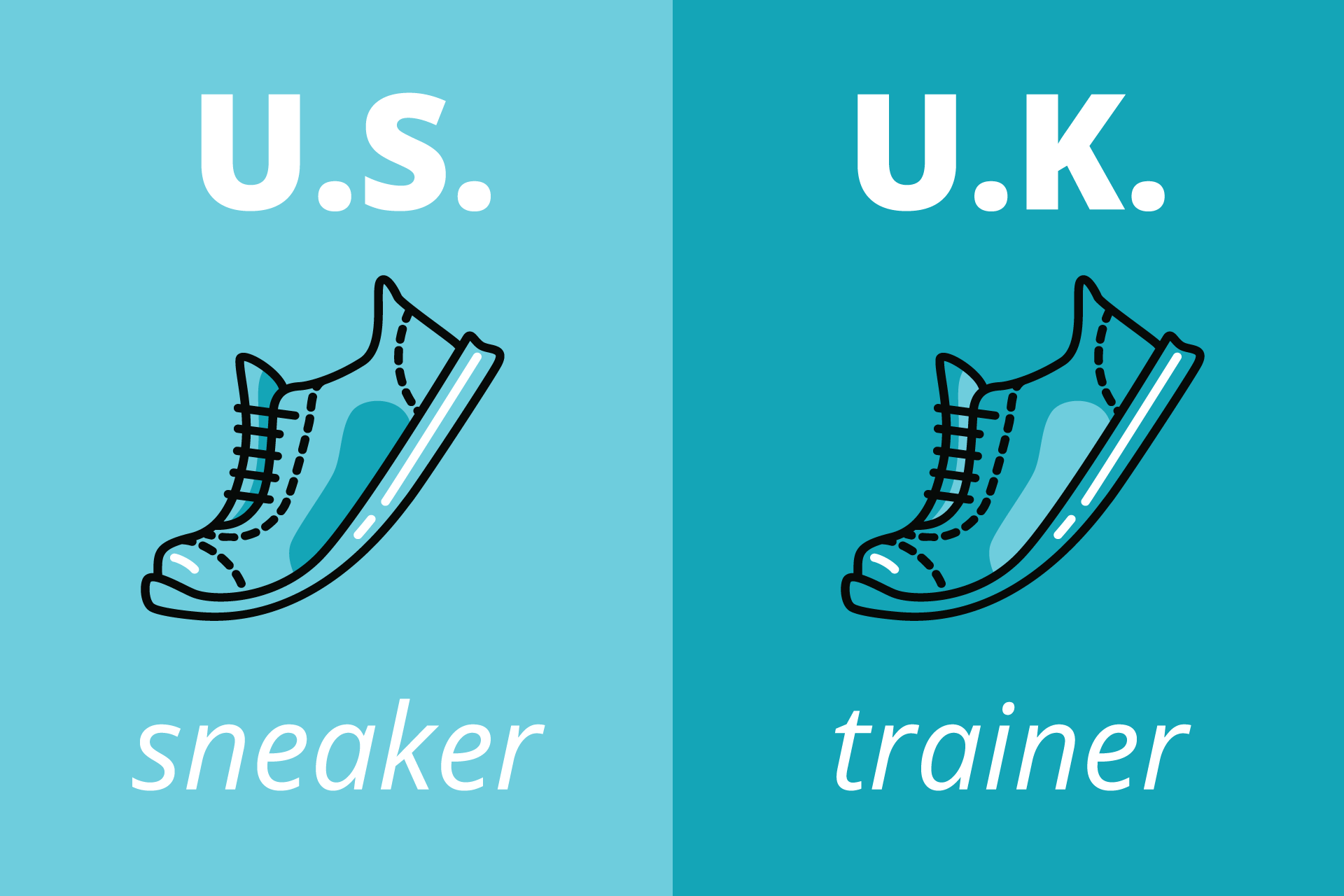
One size doesn’t fit all for translation so localizing translated copy for the intended audience is important. For example, Spanish dialects and idioms spoken in Spain differ from those in Latin American countries. Surprisingly, British and American English have many notable differences: in the U.S. we wear “sneakers”; in the U.K. they’re called “trainers” for example. The Dunes Center used local translation resources in Guadalupe to translate their exhibits, which is ideal to ensure translated content is localized for the intended audience. Localization is readily available online through translation service providers such as Monterey-based MediaLocate and LanguageLine.

Consider nontraditional design solutions for multilingual interpretation
Combining tablets, apps, content management systems, and kiosk hardware is one solution for presenting exhibit content in tight spaces where traditional panels won’t work. Inexpensive LED TVs paired with streaming devices like Chrome sticks and cloud-based services like ScreenCloud are options to consider for exhibits that don’t require interactivity—think videos or looping presentations with multilingual captions.
Use typography, typefaces, and color efficiently
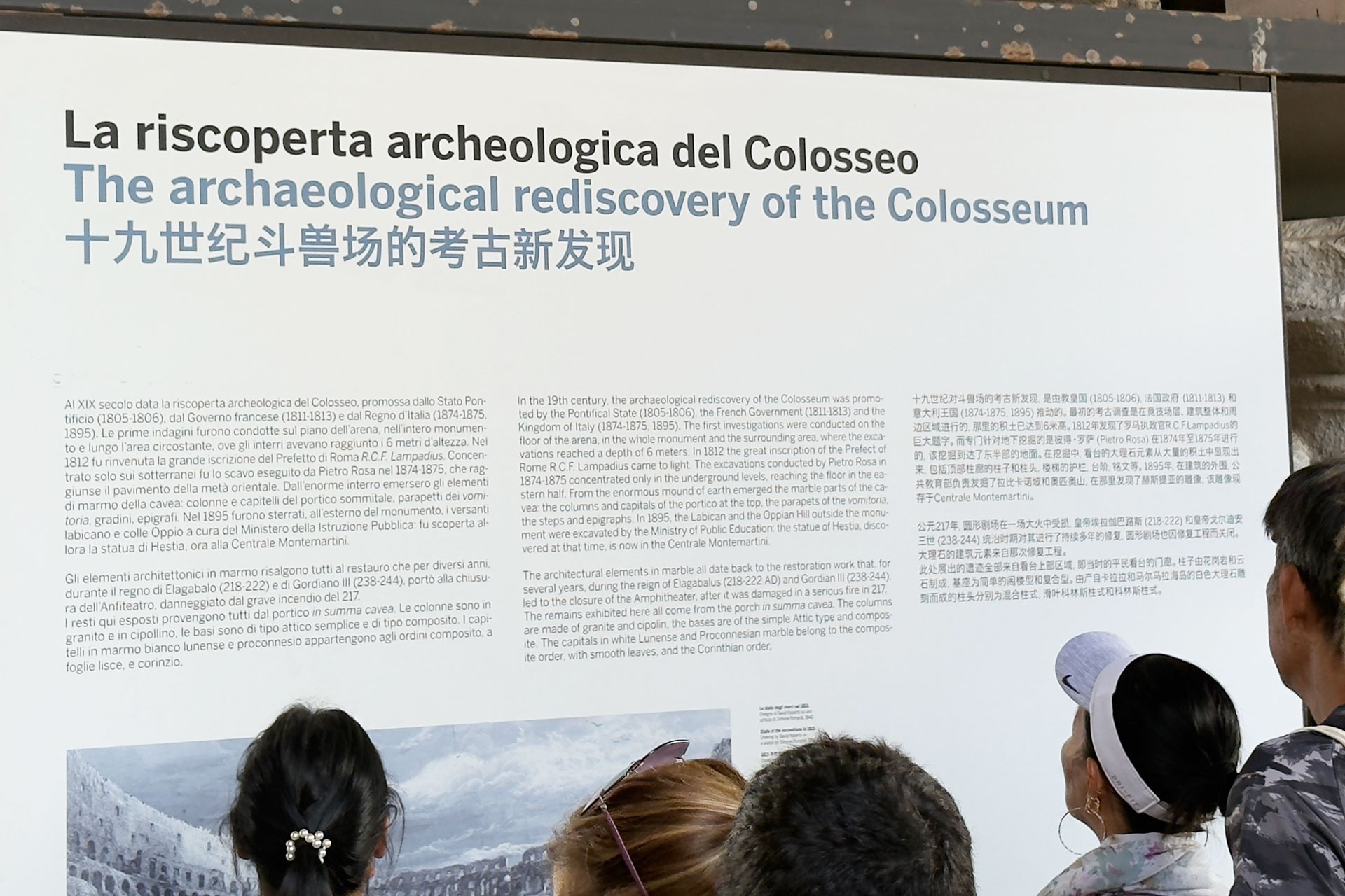
While visiting the Colosseum in Rome, I appreciated how the exhibit signage supported Italian, English, and Chinese while only using two typefaces and two colors. The design uses the distinct Chinese typeface to distinguish it from the Italian and English text without needing to introduce a third color. All in all, a very efficient, clean and practical design approach that includes three languages without sacrificing a clean design aesthetic.
 A text panel at the Colosseum in Rome efficiently uses typography, typefaces, and color to display three languages while maintaining readability, differentiation, and a clean aesthetic. (Photo: Frank Chezem)
Wrap-up
Organizations noticed years ago that their website visitors were shifting from desktop to mobile devices. As a result, organizations began adapting their websites to support mobile users as standard practice. A Pew Research Center study reports that one in ten U.S. adults access the Internet only with their smartphone, particularly younger adults, non-whites, and lower-income Americans.
Website visitors have little patience for websites that don’t function well, and they expect a good experience regardless of an organization’s size. Will multilingual interpretation soon be considered standard practice in exhibit design? Consider another study that concludes museum visitors feel more engaged, satisfied with their visit, and valued by the organization when exhibit content is in their language.
Implementing change can seem daunting… so much so that organizations do nothing or get bogged down by the logistics of implementation. While larger organizations typically have greater resources to create formal strategic plans for multilingual interpretation, smaller organizations needn’t be left behind. The DC—with a full-time staff of 3—implemented their bilingual exhibits by diving into the opportunity, keeping an open mind to creative solutions, and leveraging translation resources in their community.
 About the Author
Frank Chezem specializes in visual and graphic design with more than ten years of experience creating clear, intuitive, and authentic solutions that help people and organizations achieve their goals. He loves collaborating with marketing and communication professionals, educators, publishers, subject matter experts, non-profits, and cultural organizations. Frank is dedicated to sharing his knowledge to improve products, support people's growth, and implement design processes for organizational success. When he's not percolating ideas, you'll likely find him enjoying the scenic outdoors with a camera in hand.