By Frank Chezem
Color theory explores how colors interact, evoke emotions, and convey messages, and is an important part of any visual or graphic design process. Below is a quick three-minute rundown I’ve put together to introduce clients to the fundamentals of color theory. I’ve also included some recent color trends at the time of writing, so check out Adobe’s Color Trends for the latest color trends.
Color theory basics
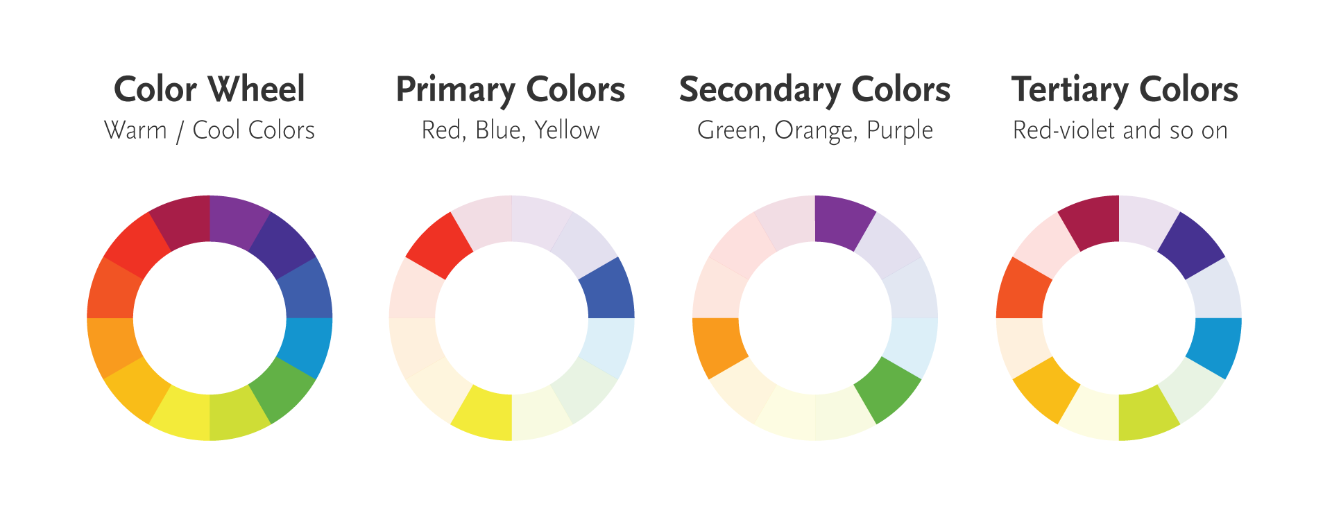
Color theory begins with the color wheel ,which is a circular diagram of colors arranged by their chromatic relationship. The color wheel dates back to 1704 and appears in Opticks by Sir Isaac Newton where he explores the characteristics and behavior of light. The wheel is a useful tool to visualize color relationships and illustrate primary, secondary, and tertiary colors:
- Primary colors: Red, blue, and yellow
- Secondary colors: Mixing two primary colors makes secondary colors such as green and purple
- Tertiary colors: Mixing a primary and secondary color makes tertiary colors such as turquoise (blue and green)
—
Color relationships
Color theory also explores how colors relate to one another:
- Complementary colors: Colors opposite each other on the color wheel, such as blue and orange provide high contrast pairings. Generally speaking, any two colors that are opposite to each other on the color wheel will pair well.
- Analogous colors: Colors next to each other on the wheel, like blue, blue-green, and green. They usually go well together, too, and create harmonious designs.
- Triadic colors: Three colors evenly spaced on the wheel, such as red, blue, and yellow. You can combine three triadic colors to create contrast in your design
- Split complementary: A base color and the two colors next to its opposite on the color wheel, creating contrast with less intensity than direct complements.
—
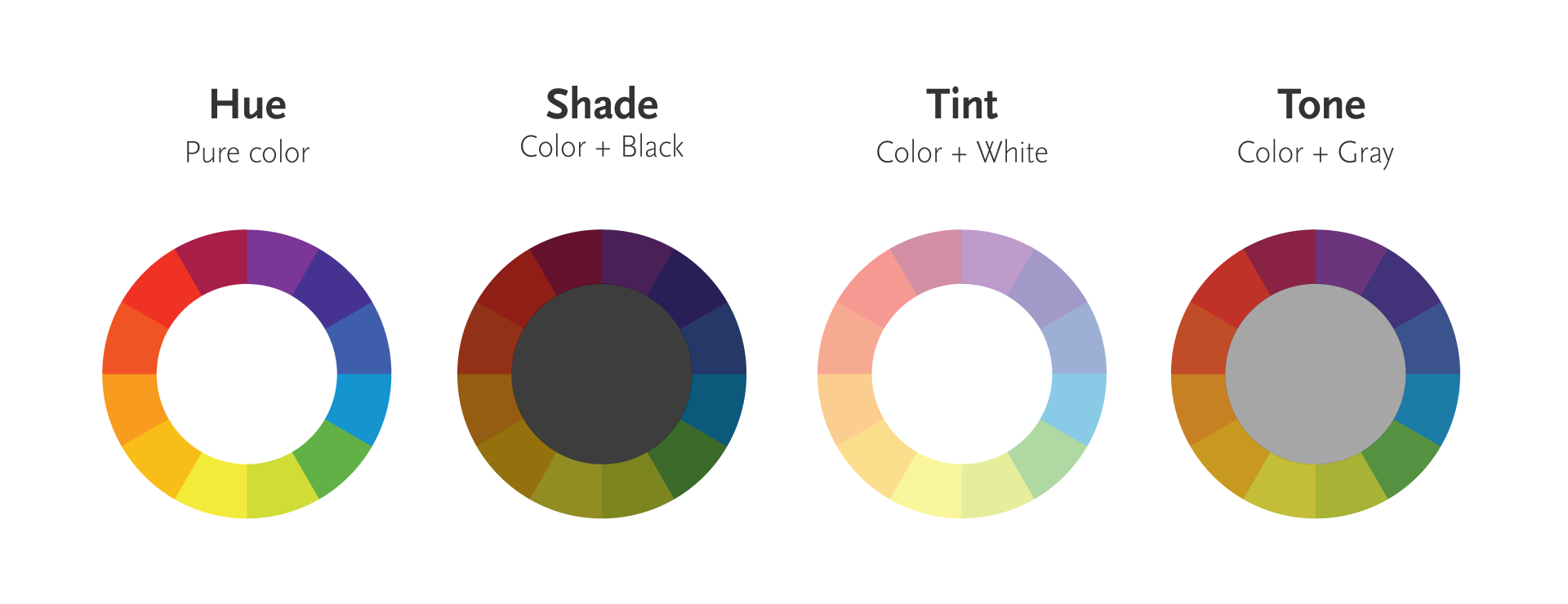
Hue, shade, tint and tone
Hues, shades, tints, and tones are great for adding nuance to designs. Hue is the pure color you see on the color wheel, like red, green, and blue. If you add black to a hue, you get a shade or darker version of the original color. Adding white to a hue creates a tint or a lighter version of the color. Lastly, there’s tone, which you can get by adding gray (a mix of black and white) to a hue, making the color more washed out and less intense.
—
Psychological and emotional impact of colors
Colors influence mood and perception. In U.S. culture, hues like red signify excitement and danger, blue evokes trust and calmness, and green can represent freshness and wealth. Color decisions play an important role in design by influencing audience emotions, guiding user decisions, while enhancing aesthetics. Below are some common color associations:
- Red: Passion, urgency, excitement, and danger
- Orange: Enthusiasm, creativity, and warmth
- Yellow: Energy, happiness, and attention
- Green: Freshness, calm, growth, safety, harmony
- Blue: Trust, health, and stability
- Purple: Luxury, mystery, and spirituality
- White: Elegance, innocence, and peace
- Black: Power, luxury, and fear
—
Color on printed materials versus color on digital screens
Color shown on digital screens uses RGB (red, green, blue) light known as additive color. Light is emitted from a source such as LED pixels on a laptop screen to create bright and vibrant colors. In contrast, color on printed materials are known as subtractive color and use CMYK (cyan, magenta, yellow, black) or Pantone inks to reflect light. Designers need to make adjustments to match the colors between digital screens and printed materials.
—
Recent trends in color theory
- Muted palettes: Recent design trends favor muted, desaturated colors, providing a sophisticated and modern look and soothing and less aggressive feel.
- Gradient designs: Gradients continue to make a comeback, adding depth and dimension to flat designs for a more dynamic visual effect.
- Color and accessibility: With more focus on inclusivity, choosing accessible color palettes for people with color blindness should be considered. Check out these color combinations for tools that maintain readability and clarity for diverse audiences.
- Sustainable colors: Earthy tones and natural colors are trendy and communicate sustainability and eco-friendliness.
—
Wrap up
Color theory is an important tool for visual communication that’s not just about aesthetics. Understanding color fundamentals, psychological impact, and recent color trends is essential for creating compelling and effective designs, whether in art, marketing, or user interface design.
Check out these three websites to learn more about color theory and to experiment with creating color palettes:
Adobe Color
Coolors Color Palette Generator
Figma Color Wheel
 About the Author
Frank Chezem specializes in visual and graphic design with more than ten years of experience creating clear, intuitive, and authentic solutions that help people and organizations achieve their goals. He loves collaborating with marketing and communication professionals, educators, publishers, subject matter experts, non-profits, and cultural organizations. Frank is dedicated to sharing his knowledge to improve products, support people's growth, and implement design processes for organizational success. When he's not percolating ideas, you'll likely find him enjoying the scenic outdoors with a camera in hand.